Mind your website user.
Partial website redesign in order to improve usability and increase leads.
_
The Problem:
Real estate websites in South Florida are fed by an API that brings large amounts of irregular data. The challenge was to design a listing page (home-for-sale page) that would work despite
all inconsistencies such as: bad photography, missing or wrong information, unusual long strings of text, such as street addresses or agent names.
After watching 6 agents use the website (via Zoom), I decided the following were the most important problems to target in the new design:
Skills:
Web Design
User research
Problem analysis
Tools:
Figma
Client:
Fortune International Realty
www.fir.com
Listing pages samples:
Sample 1
Sample 2
Sample 3
When properties are sold, their page is disabled, therefore, the pages above may not be available at the time you visit this website.
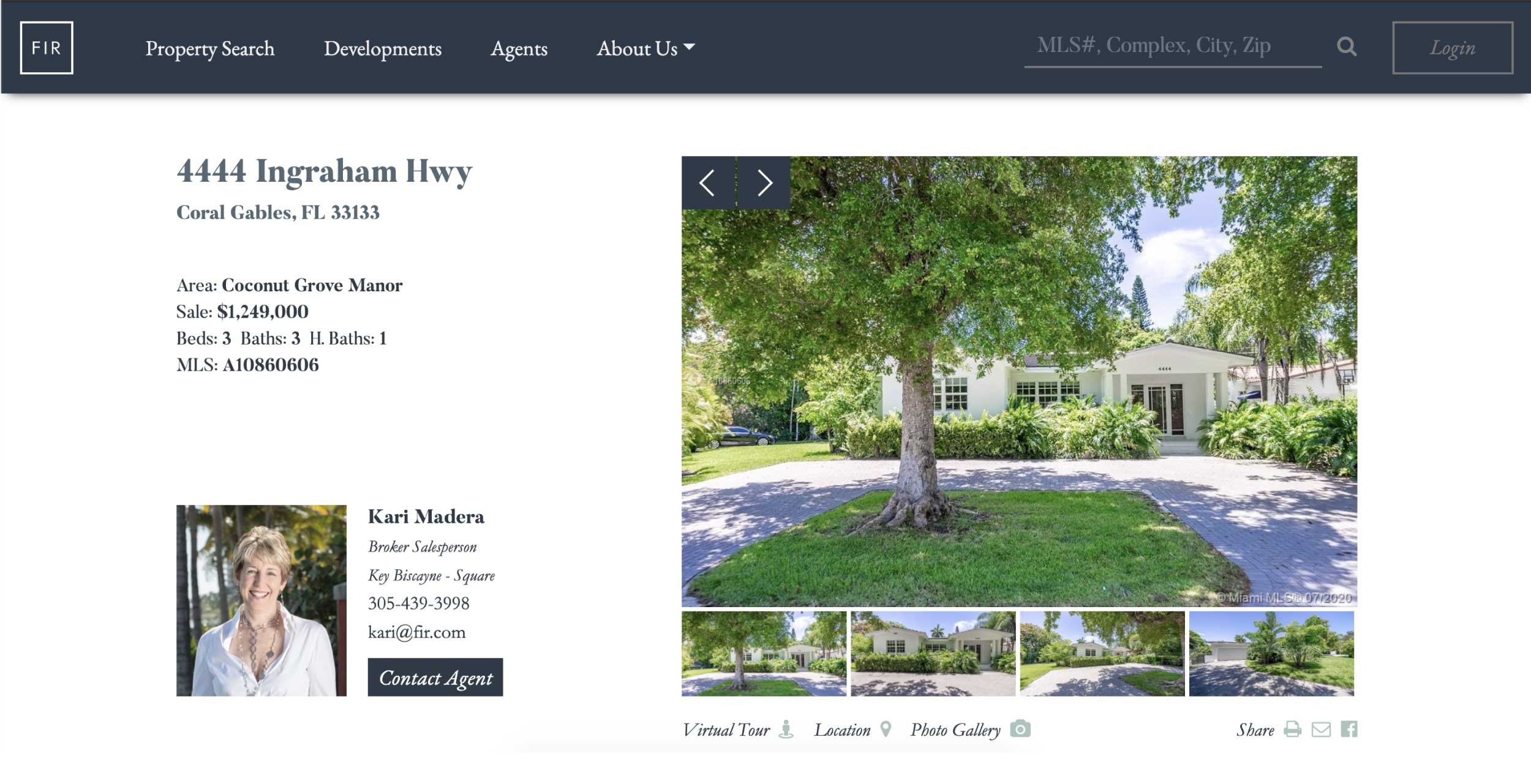
1. Above the fold issue. Agents’ information was cut off on laptop computers, which are the most widely used device, according to the company’s research.
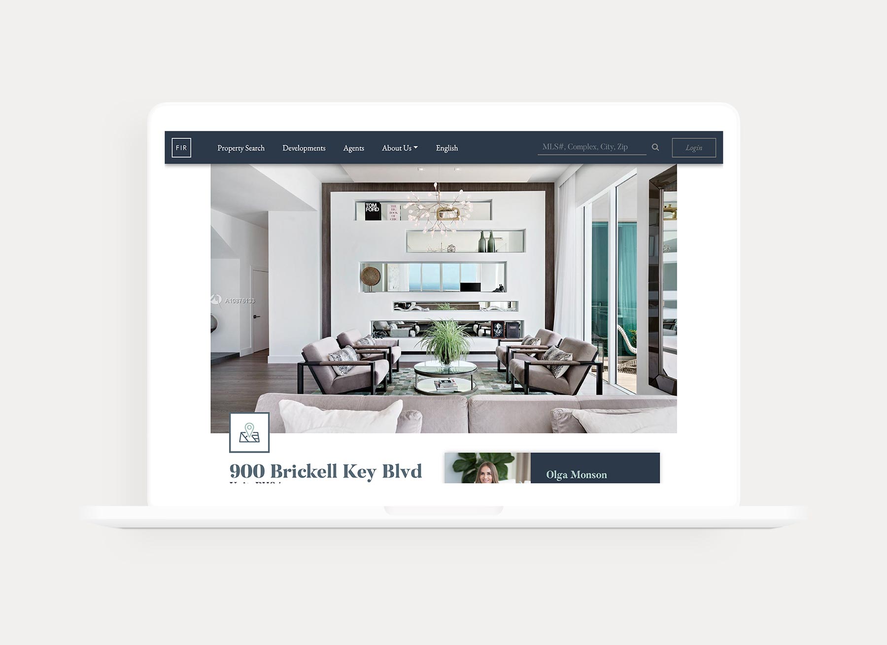
2. Listings with bad photography: The old design featured one of the property images as hero for the page. Since we couldn’t control the image quality of every listing, the results were terrible in many instances.
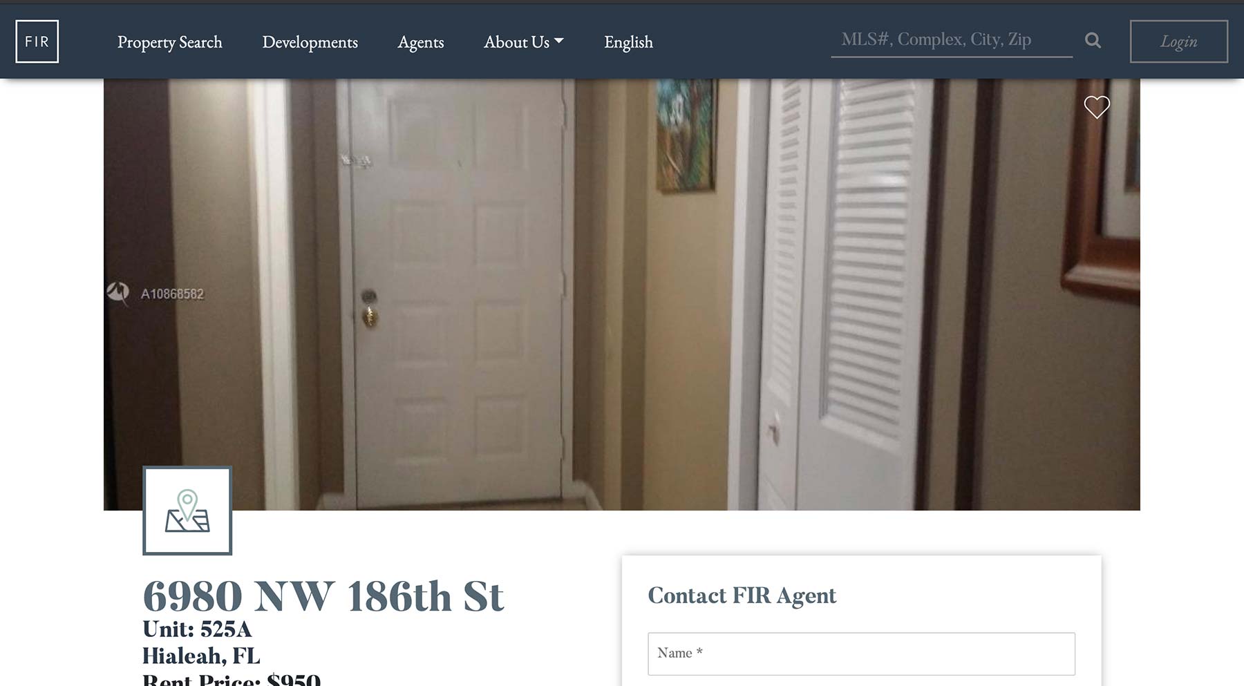
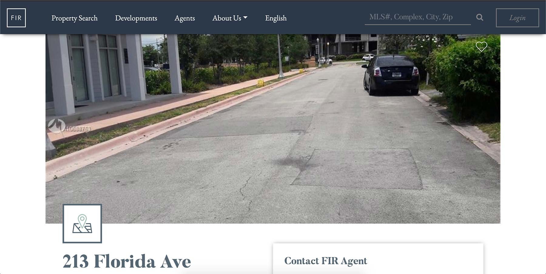
3. Information architecture: Address appears twice, poor hierarchy and too many font sizes and colors.

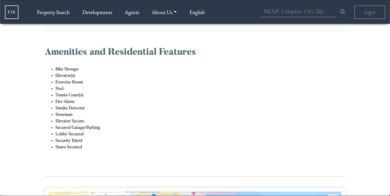
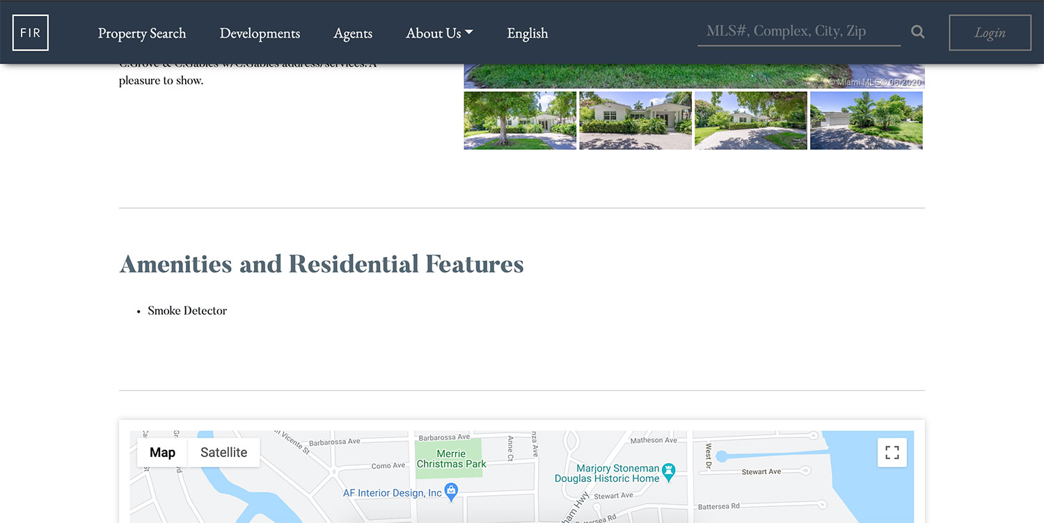
4. Layout issues due to poor design and source information inconsistencies: Property owners and realtors complained that their properties showed incomplete information.
The Improvements:
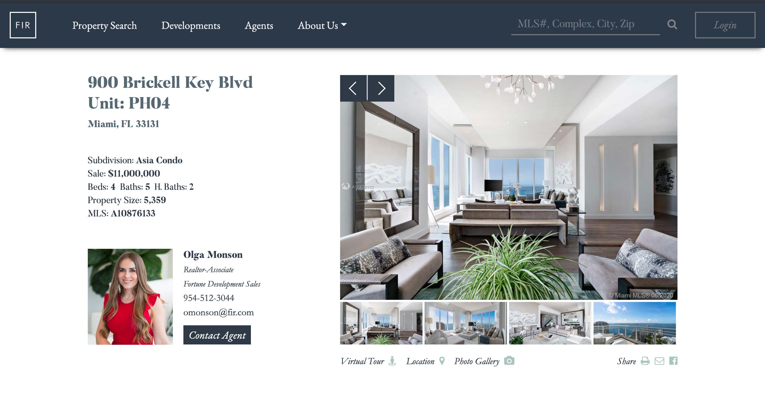
- Including complete information above the fold
- The big featured header image was eliminated, instead we included an image slider that would showcase all property photos.
- Adding a contact form instead of mailto to be able to track leads.
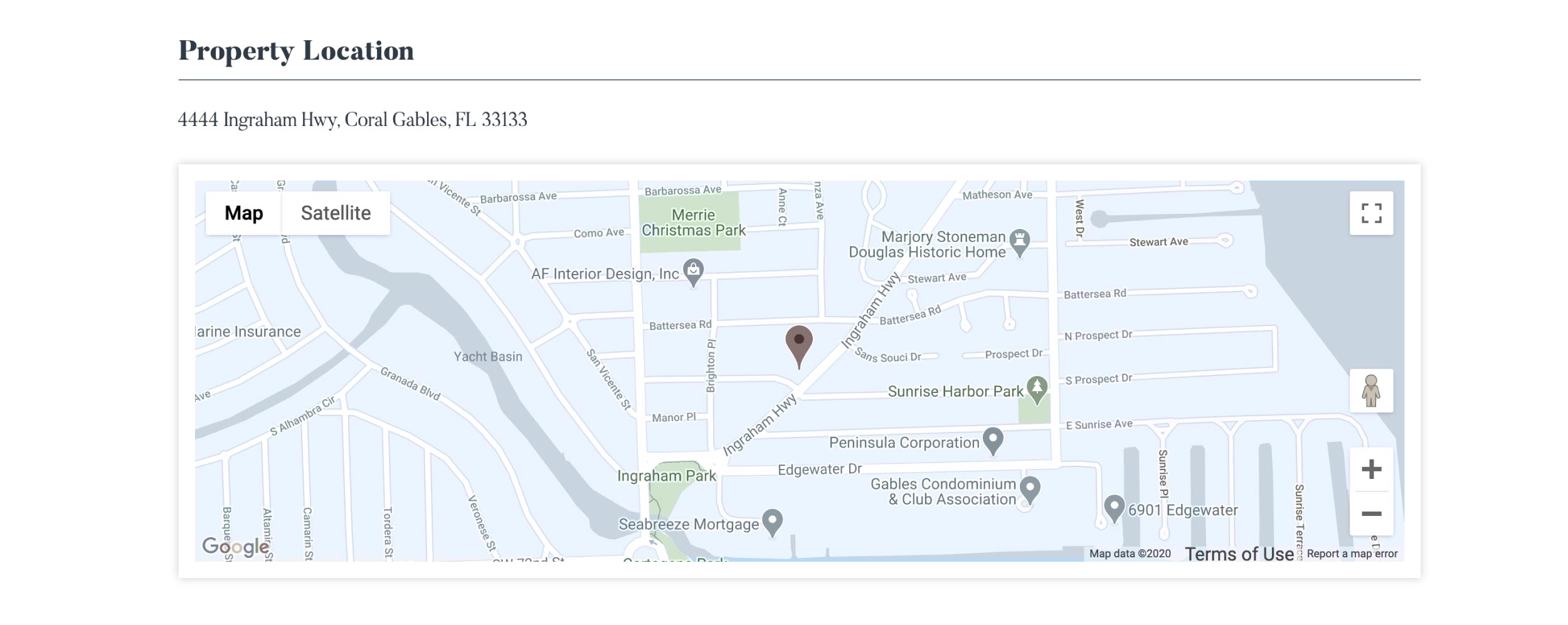
- Including links above the fold to navigate to the information of most interest: Location and virtual tours were the two most requested links during research.
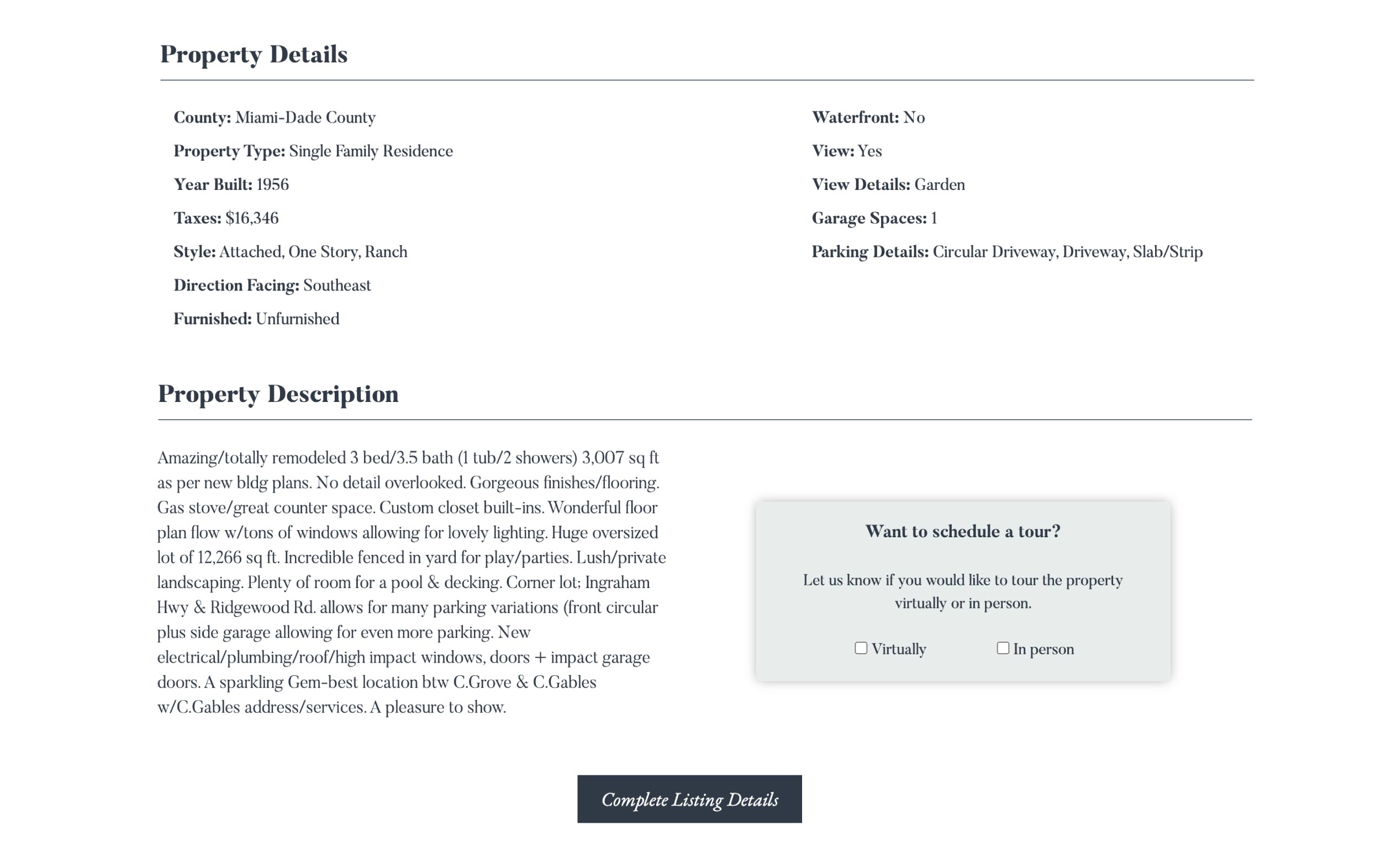
- Improving information architecture.
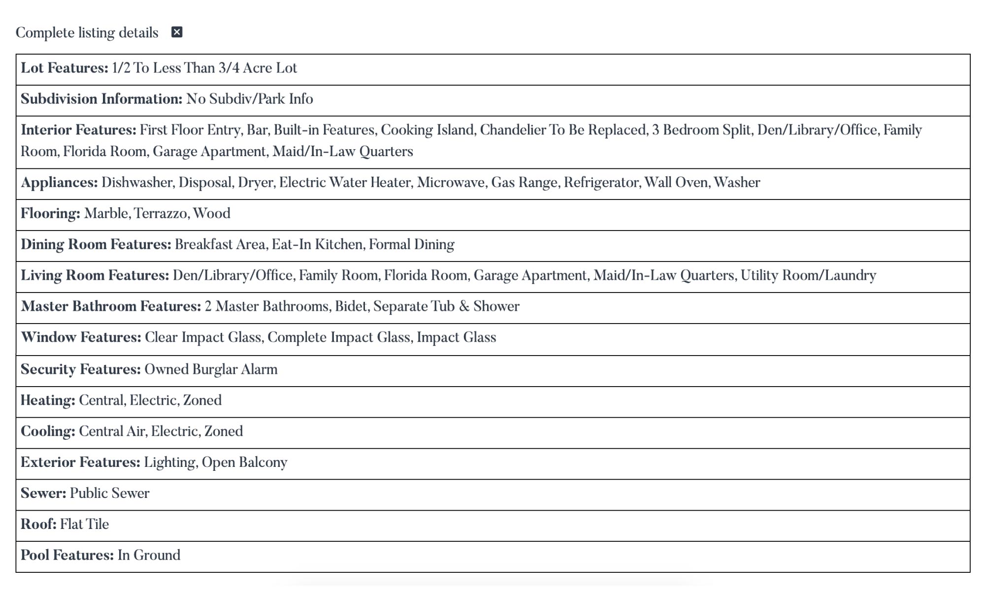
- I worked with the programmers in filtering out all inconsistent data, which was presented optionally with the click of a button.
- Adding a new contact form to draw attention to the option of visiting properties virtually (a new need post-pandemic)
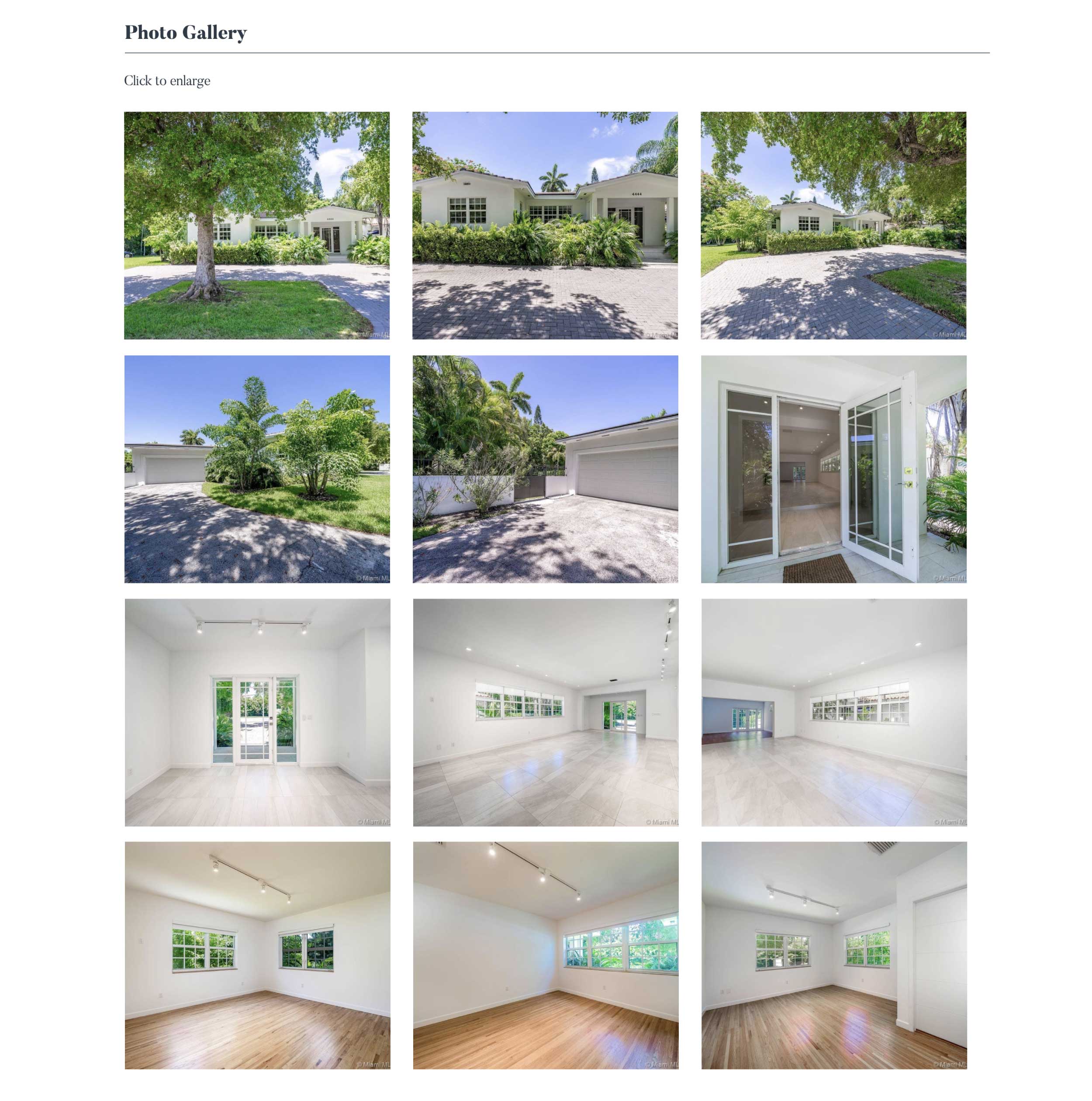
- Including an additional photo gallery at the end of the page for a last glimpse of the property. Users had requested the ability to see all images displayed at once.
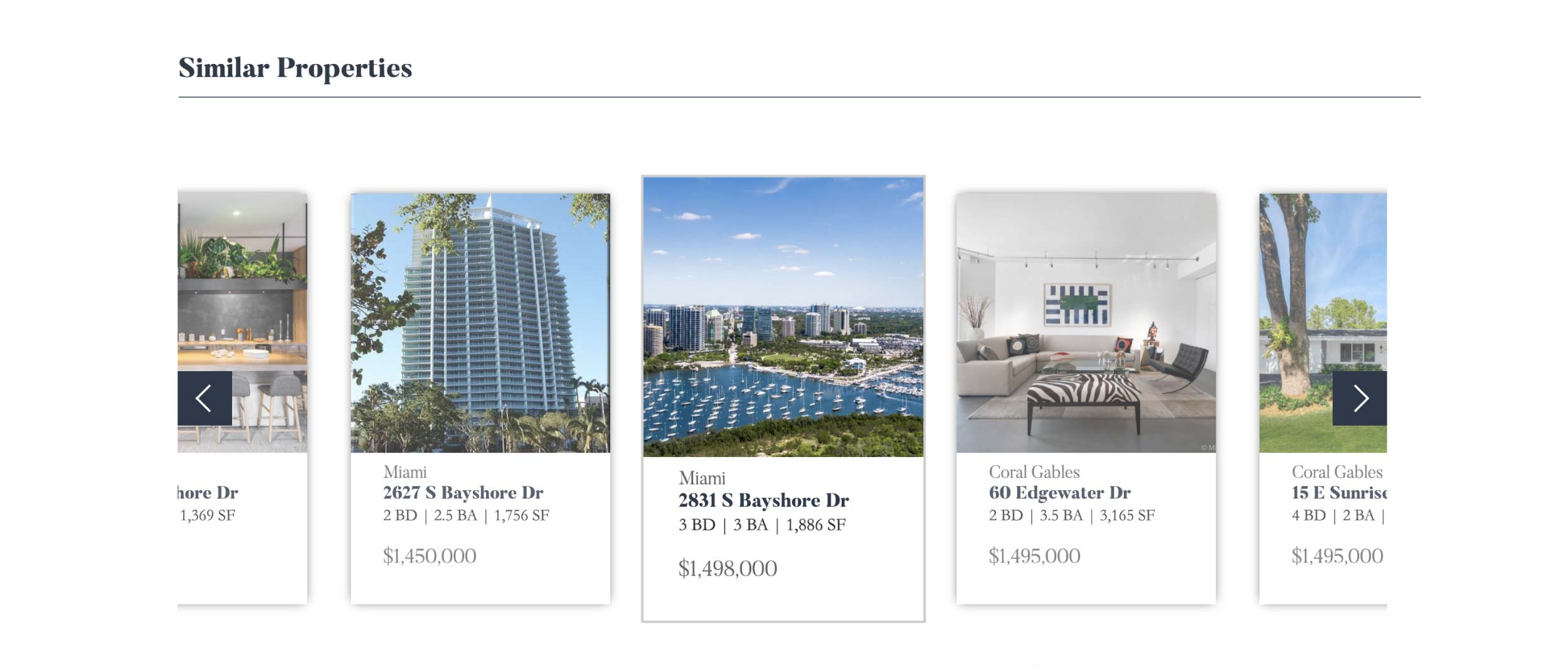
- Added a carrousel with similar properties at the end of the page.
The Results:
The new page produced an increment of leads which were easy to track an categorized. Agents also started using these listing pages in their presentations and meetings with owners, which they were not doing before. The website is now also used internally to find information on listings.
Final Page:
